Thursday, 12 April 2012


Tutankhamun was an Egyptian pharaoh of the 18th dynasty (ruled ca. 1332 BC – 1323 BC in the conventional chronology), during the period of Egyptian history known as the New Kingdom. He is popularly referred to as King Tut.
The 1922 discovery by Howard Carter and George Herbert, 5th Earl of Carnarvon of Tutankhamun's nearly intact tomb received worldwide press coverage. It sparked a renewed public interest inancient Egypt, for which Tutankhamun's burial mask remains the popular symbol. Exhibits of artifacts from his tomb have toured the world. 

Tutankhamun was buried in a tomb that was small relative to his status. His death may have occurred unexpectedly, before the completion of a grander royal tomb, so that his mummy was buried in a tomb intended for someone else. This would preserve the observance of the customary seventy days between death and burial.
King Tutankhamun's mummy still rests in his tomb in the Valley of the Kings. On 4 November 2007, 85 years to the day after Carter's discovery, the 19-year-old pharaoh went on display in his underground tomb at Luxor, when the linen-wrapped mummy was removed from its golden sarcophagus to a climate-controlled glass box. The case was designed to prevent the heightened rate of decomposition caused by the humidity and warmth from tourists visiting the tomb.
Tutankhamun seems to have faded from public consciousness in Ancient Egypt within a short time after his death, and remained virtually unknown until the 1920s. Eventually the location of the tomb was lost because it had come to be buried by stone chips from subsequent tombs, either dumped there or washed there by floods.

Wednesday, 29 February 2012

Dan Mountford

I came across Dan Mountford's work just browsing and I think his work is really inspiring and amazing. I like how he uses photography to create what looks like pictures montaged together, when really he has used all in-camera techniques (double exposure) and simply removed parts and edited colours using Photoshop and Adobe Illustrator.


The Butterfly Lion is one of my favourites from his work. There are no Photoshop overlays, the only thing edited in Photoshop is the colours, the actually images were created in-camera by double exposure. I think is very creative and talented as he is able to capturing beautiful images and create amazing piece of work. It is unique and his style has soft colours most of the time, following a similar colour scheme, or using black and white. Also, my favourite out of his black and white work is Vall // Old Brighton Pier. It looks simple, but at a close look you can see the time and effort that has been put into these shots and getting them precise. It gives off a peaceful sentimental looks, and all of his work looks welcoming and interesting to look at because of how visually unique and unusual it is.

He also does hand made illustrations.


I love this illustration. He created the antlers by using coffee which made the brown stained look. As for the body, they are made using simple individual straight lines, showing the effort put into it. I think that the use of colours are effective and I like the fact that they aren't the typical deer colours, they're bold and the mixed media of coffee and ink makes a great effect. Also, the fact that there are only two colours make it much more effective than if there was lots of other colours mixed in with it. I would like to try and incorporate some of his style into my own work and experiment with some of the the things he has as they're individual and really do create some wonderful effects.

Friday, 3 February 2012

Website Review

I'm going to critically review four different websites, depicting their downsides and what is good about them. The Computer Arts magazine, Creative Review, Boneshaker magazine and Vasava.

The first one I have chosen is the Computer Arts magazine website, I like this website because I think it is well designed and set out in a way that is appealing to the eye. There is good colour usage, the same colour scheme follows throughout the website and it gives it a clean look with a simple white background. When you open an article, the theme is similar to the homepage, following a simple design with text and images in a uniform down the page. Image, text, image, text. I like how simple the toolbar is at the top of the page, it has good positioning and easy for the users to find.

Next, I looked at the Creative Review website. There is much less colour to this website, it is much more formal. The images on the website are the only things that bring colour to the page, the design is made up of greys, blacks and white. There is simple easy to read font that is friendly to the user however, I am not so keen on this website and I was the previous. Personally, I don't think that it is that interesting. It lacks colour, and it doesn't match what the company is promoting. 'Creative' is meant to involve the imagination or original ideas, and as far as I can see this website does not show anything creative in it's design. Also, I do not like how when you hover an image or an article, it turns yellow. It doesn't really look aesthetically nice to block things out with yellow.

Boneshaker magazine website is well designed. It is simple yet effective and easy for a user to access and get around. It uses simple soft colours with cute illustrations at the top relating to cycling, this gives the website a welcoming feel and relevance to what the site it about.. The shop page has it's own different illustration and I think this is effective, it shows the different design ideas put into the website, andnot just a plain layout on every single plage. I think that this is a successful website, it is appealing to look at, it is easy to get around and it is welcoming for their target audience, cyclists.

Vasava is my favourite website out of the four I have researched. It's design is unique and fits to the side of the browser, making good use of the space provided for websites. I like the fact that at first, all of the images appear to be black and white but when you scroll over them with the cursor, their colours return, highlighting the image you are on, giving appreciation to itself before you scroll over to another. The tool bar to the left of the page is useful, allowing you to pick a topic of what you would like to look at, it then refines your search into the catergory that you chose. Also when you scroll down, a small arrow apears to the right hand side that will take you back to the top of the website, it is a hand tool for websites that use endless scroll. I think that this website is the most effective, it is striking in design and is a great idea to show all of the images together.

Stanley Donwood

Stanley Donwood is the pen name for the English artist, Dan Rickwood. He is well known for his close association with the British rock group Radiohead having created all of their album and poster art.
He graduated from the University of Exeter and went on to work as a freelance artist in Plymouth. Alongside all of his work for Radiohead, he also maintains his own website where he publishes short stories and other writings. 

His work is dark, mysterious and strange however, interesting. There is depth to his work in which his personality is shown. Not only is he a skilled drawer and painter, he has skills in printing. A lot of his work is black and white. This makes his work unique to his style, it keeps it simple and effective and appealing to look at. His more coloured pieces are also interesting, I especially like his oil paintings/graphite drawings of trees and forests, they are unique in style and use a wonderful range of colours that really make the pieces work. I already liked this style of work as I think that they make beautiful pieces of artwork, as they can be bare and simple, or full of life and detailed. It can be what you want it to be and there is an endless amount of options and outcomes that you can create just from this style and the choice of subject. He is talented when it comes to drawing and painting, he knows how to get correctly proportioned shapes and has a skill in shading appropriately and realistically. He can put in a lot of detail but also, he can use a little and make it still look as effective. I took these images from his personal blog

He has also worked on last years Glastonbury Festival 2011, as he has since 2002. I like the 2011 design, there is a lot of attention to detail and a rainbow of colour. I love the aspect of it; the way in which it was designed is clever and very eye catching. There is even detail that probably wouldn't be seen unless you looked closely into the design and that's what I like about it. Donwood himself said, 'as usual it was difficult to get it right and some of the pictures I made whilst trying to get it right were so bad they suprised even me, and I'm used to the sorts of horror that I'm capable of.' I like how he admits that it was difficult to think of an appropriate idea for the design and that even he, a well known designer can mess up. Overall I think that his work is very good, I love his style and how he can flexibly create different designs and how he likes to experiment, he is unique, successful and a very talented designer. 

Sunday, 29 January 2012

24/01/12 - Collage drawing of objects

Today, we created a collage of drawings from objects on the table before us, using mixed media. At first, we created small sketches of what we planned on drawing from the objects around us and stuck them in our sketchbooks. I used charcoal, chalk and pencil to create the images. When I used chalk, I drew on black tissue paper so it stood out.

We took inspiration from the artist Ben Nicholson, a lot of his work is flat still life with bold colour and shapes. There isn't so much detail in his work in comparison to other artists, however it is just as effective. I like his use of colour, they're not the exact set colour of the object, they are different and stand out. It showed me that I do not need to be precious with my work, and that sometimes mistakes can have a positive outcome in my work as his work shows that perfection is not needed to create a quality piece of work.

Ben Nicholson was a British painter of abstract compositions of landscape and still-life. He had a gift of incorporating European trends into a new style that was recognizably his own, from the likes of Picasso who used cubism. His first notable work was following a meeting with the playwright J. M. Barrie on holiday, Barrie used Nicholson's drawing as a base for a poster for the play, Peter Pan. He was a great traveler and ventured to many places such as America, Paris and Switzerland. He believed that abstract art should be enjoyed by the general public so he created a mural for the garden of Sutton Place in Surrey. Some of his artwork can be seen at the Tate St Ives gallery, Kettle's Yard Art Gallery in Cambridge, and The Hepworth Wakefield.

In my A1 piece, I took into consideration his work and also from another artist, Rosie James. For her work, she uses sewing to outline things and fabrics. For the umbrella, I used a sewing machine to outline it, leaving pieces of the end of the string attached to give it texture and difference. I made the insides using newspaper and PVA to give it a shine, as this gives it a layering looks and to make it more interesting. For the two skulls, I used black and white tissue paper, chalk and charcoal, I then glued these down and plan on using PVA over the top when the entire piece of work is finished. I need to further develop this piece as it is a bit plain and needs more textured layers, colour and drawings. I need to develop other techniques into my work and work faster in order to get a better outcome than what I produced here.


Improvements:
I used a teabag to stain the page and make it look more interesting and less plain than having a white background.I also went over the skulls with chalk and charcoal again to make them bold and stand out more.


These are the objects I drew my sketches from and used to create the large final piece:


Thursday, 19 January 2012

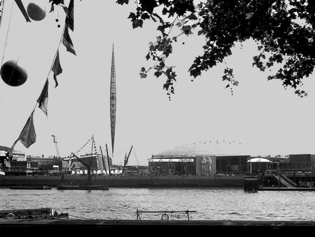
The Festival of Britain was a national exhibition held throughout the United Kingdom in the summer of 1951. It was organised by the government to give Britons a feeling of recovery in the aftermath of war and to promote the British contribution to science, technology, industrial design, architecture and the arts. 
At that time, shortly after the end of World War II, much of London was still in ruins and redevelopment was badly needed. The Festival was an attempt to give Britons a feeling of recovery and progress and to promote better-quality design in the rebuilding of British towns and cities. The Festival of Britain described itself as "one united act of national reassessment, and one corporate reaffirmation of faith in the nation's future."

The arts were displayed in a series of country-wide musical and dramatic performances. Achievements in architecture were to presented in a new neighbourhood, the Lansbury Estate, planned, built and occupied in the Poplar district of London.
The Festival's centrepiece was the South Bank Exhibition, in the Waterloo area of London, which demonstrated the contribution made by British advances in science, technology and industrial design, displayed, in their practical and applied form, against a background representing the living, working world of the day.

Thursday, 5 January 2012

Kid Acne

At just 12, Kid Acne began painting graffiti inspired by scale, colour and immediacy and knew from then, he was talented. Today, his artwork can be seen world wide in Sheffield, London, Manchester, Berlin, Hamburg, Dresden, Barcelona, Milan, Paris, Lyon, New York, Sao Paulo, Rio de Janeiro and many more in places he has travelled to and he has even worked for world's leading brands like Prada and many others.
Acne was born in South Africa and was raised in Leicestershire, he is now currently based in Sheffield; Kid Acne has released a number of records sporadically throughout the past decade in the genre of rap. They have been very successful to the young hip audiences who enjoy rap and hip-hop music. He was first inspired to write from listening to his friend’s pirate radio when he was young, he wanted to create his own music to express himself other than through his artwork.
His art career began with an appearance on Rolf's Cartoon Club at the age of twelve. Within a year, he'd started writing graffiti by its’ infinity of being anything he wanted it to be, he loved creating artwork. He has painted large murals in Sheffield and across the globe; he has designed Prada T-Shirts, skateboards, and knitwear. He also has his own spray cans and has designed a new range of toys for New York's Kid Robot brand.

With a small group of friends, he spent his teenage years making underground fanzines and releasing limited run 7's on their Invisible Spies imprint. In 2001 the comic book, Kid Acne jointly created Zebra Face with Supreme Vagabond Craftsman. The book follows the adventures of a two dimensional zebra faced superhero and his diabetic sidekick as they battle in a 2D galaxy of scattered baddies. Through indie record, book and clothes stores and by mail order, Acne proudly shifted 1000 globally with no distribution deal website or blog. Now ‘five, three minute animated pilots are being developed, as adaptations from the book’ set to screen this time next year, with new scenarios.
I think that Kid Acne's work is very original, he has created his own style over the years, bringing through what he learnt when he was young and improved on it so much. He uses bright bold colour in his graffiti work, surrounded by a thick black line to make it stand out and to catch the eye of passers by. His work is cartoon like, perhaps to promote towards younger people to inspire them into making their own art and to be original in what they do, like him. Not many graffiti artists have a cartoon theme like his; it definitely stands out from the crowd and is recognizable to almost anyone who knows anything about artwork, as it is completely original. I could use bits of his style in my own work at some point when relevant as it is effective and I really like the style. He is incredibly successful and has a large fan base across the globe.
The cover of Kid Acne's When The Smoke Clears


Here is one of my favorites from a vast range of his work, I love how simple it is, a black and white image with a unique design of twins who look like they might possibly dressed as sunflowers. Their faces are strange, almost as if they are quinting at something or maybe that's just how they look.


I also like his quote pieces, I like how they are all in a similar style when it comes to the font and the actual design except with different colours, making them noticeably his as they are unique to his personality and reflect who he is. This work can be seen in many different places from sides of houses, buildings, walls and on canvas', like this particular image.