Friday, 21 June 2013

Exhibition


The final piece of work I chose to mount for my exhibition. I included my website, some of my own photographs, an illustration and my final major project work, book cover designs.
I am happy with the work I have put up, I think it shows off a good range of the different things that I can do. My favourite piece up is probably my website design. A lot of time and effort went into it and I think that it is my best piece of work.

Wednesday, 12 June 2013

 This was a double page spread I did, researching into director of animated films Jamie Caliri. He has worked on commercials, music videos, and film title sequences, all shorts but very influential.
His style is very distinct, and it follows through in all of his work. He mainly works in stop motion, and they are incredibly smooth, showing how much time and dedicated effort he puts into each piece. In my own stop motion animation, I think that I showed my influences from his work. I showed flat characters and a flat landscape, however at the beginning, I switched from reality, to paper stop motion.


This was a simple task in which we re-created a companies logo and simplified it as much as possible.

I picked apart the colour, the shapes, everything I could to make it into a very simple design.
A started off by taking away the texts bubbly shape and made it into a more block type. I then took away the bubbles around the type and began to work on the text.
I took the colour into black becauseI felt that I need to take the background colour away to make it as simplistic as possible.
I then stuck to an rectangle shape to build the letters, and although it doesn't necessarily look like it says Skype anymore, it was striped down to basic shapes, and this can be used all throughout design.

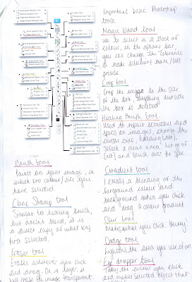
The photoshop toolbar, picked apart from my sketchbook work.

I took each tool and outlined what they were and what they did. I then got examples of some of the tools in use, and showed the difference of before and after using them. 


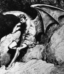
A simple trace of a selection of figures I found in a book about angels and demons. I did this to try and collect imagery and ideas towards my project and develop from this. 


An angel I did research was Lucifer, the Fallen Angel, an archangel. The name Lucifer literally translates to the Morning Star, and his name as become a by-word for Satan in the Church and in popular literature. He believed that he should have been worshipped over God, and the anger and jealousy and abuse of power caused him to be banished from heaven sent down to hell. God "clipped his wings." 

Gabriel was also a part of the archangels that God appointed, typically serves as a messenger to humans, from God. In the bible, Gabriel is only ever mentioned twice, once in the old testament and once in the new. In the Gospel of Luke, Gabriel is referred to as "an angel of the Lord.'

Movie posters for 500 Days of Summer and Thor in the style of some artists that I chose to research using water colours. 

I particularly like Ed Rusha's work. His style is so simple, and mainly typography based, using riddles about what we think we know against dramatic skylines or coloured backgrounds. He uses different sized text white text, to emphasise meaning to certain bits of the quote. There may not look like there is a lot to it, but in depth, there is meaning and thought into the work. 

Memoirs Of A Geisha


A simple water colour painting I did for the cover of my sketchbook for the Film Title Sequence project. 


Some research I did looking into the history behind a Geisha, and the culture. 
Also an artist from the era, Tsukioka Yoshitoshi, who didn't have the greatest luck when it came to his career. I think that his work though, is very influential to the work that I created and even though he wasn't always successful, he carried on doing what he enjoyed. His career spanned two eras the last years of Edo period Japan, and the first years of modern Japan following the Meiji Restoration. I like  him as an artist because he was concerned for the traditional Japanese art, and stuck to the techniques and way he knew in effort to try and save it.


I put the drawing into Photoshop and got rid of any specs from the paper inside the geisha, and outside. I also cleaned up the characters and made sure there was nothing that could be seen on the paper from the original when printed out. I got rid of the original text because I felt like it kind of ruined it and looked cluttered. I resized the bottom characters and aligned them with the geisha. I liked how simple it looked, and decided to use it as a final piece in my exhibition.